TIMELINE
Aug 2022 - June 2025
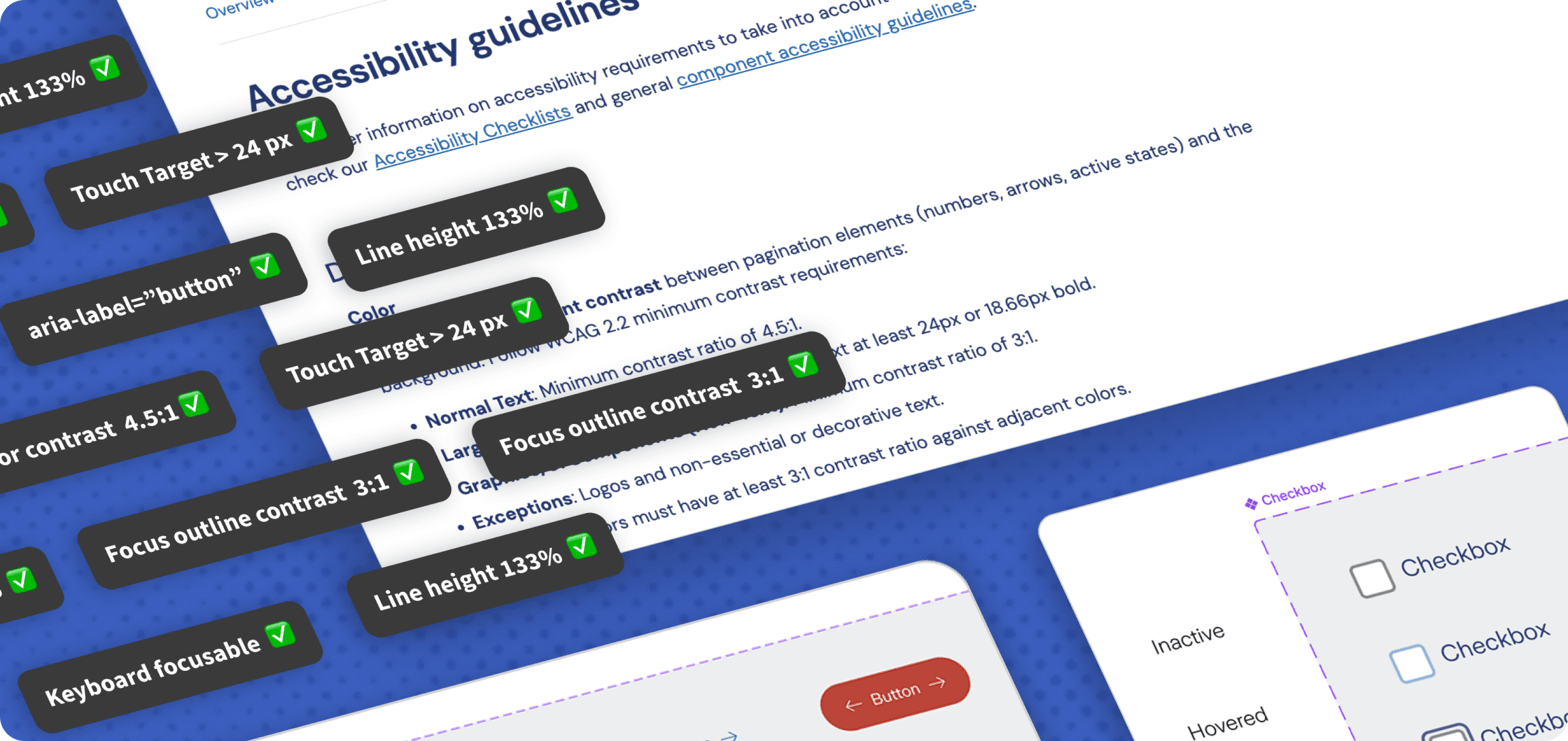
During my time spent as a Design System Designer, I've tackled different challenges, such as implementing design tokens, creating, documenting and improving components. Nonetheless, the most complex and meaningful challenge has been without a doubt tackling the topic of Accessibility.
TIMELINE
TEAM
ROLE
Accessibility gap: The existing design system did not meet accessibility standards, creating barriers for users with visual, motor, and cognitive impairments.
Inconsistent UI Components: Color contrast, typography, and interactive elements were inconsistent, leading to usability issues and poor design scalability.
Legal and cultural shift: 2025 legislation required WCAG 2.1 AA compliance, while stakeholders needed greater awareness of inclusive design's value.
As a Design System Designer, together with the Lead Designer, I've played a major role in embedding WCAG principles across foundations, components, and documentation. Key areas of improvements to which I contributed include:
WCAG 2.1 Compliance: Design system now meets WCAG 2.1 AA standards across all components.
Inclusive experiences: an accessible design system is the base for fostering inclusive design throughout the company.
Reduced design inconsistencies: following WCAG guidelines turned out to improve the design system quality and efficiency.
Future-Proofing: Teams are equipped with knowledge and tools to maintain accessibility in new features.
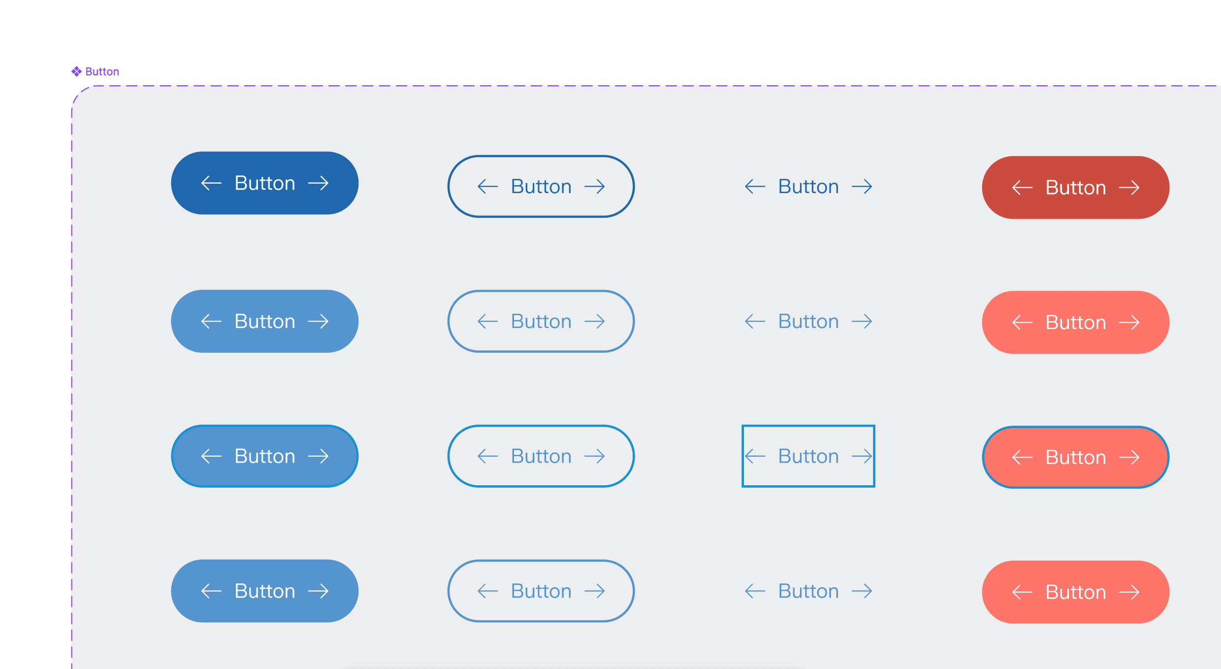
Ensuring WCAG-compliant contrast and clear status indicators beyond color alone
I've adjusted palette to meet minimum contrast ratios (4.5:1 for text, 3:1 for UI elements).
WCAG Success Criteria:
Before
❌ Insufficient color contrast between background and text
❌ Insufficient color contrast between focus ring and most palette background colors
❌ Insufficient communication of state changes
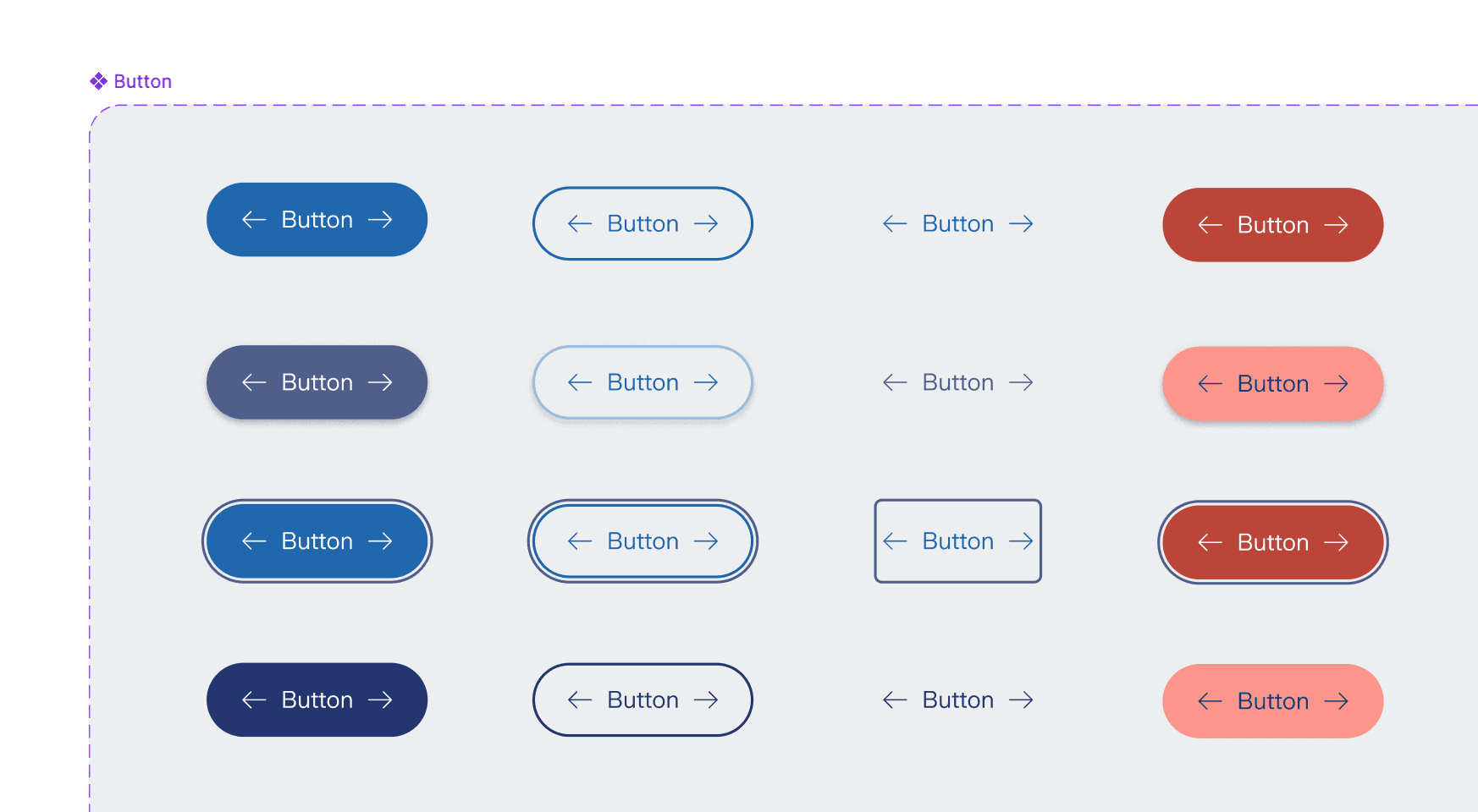
After
✅ Meeting sufficient color contrast between background and foreground (4.5:1)
✅ Improved contrast of the focus ring against the component and the underlying background
✅ State changes communicated clearly (e.g. shadow effect on hover, instead of only color change)
Adding consistent, high-contrast focus rings to all keyboard-navigable elements
Focus state was not only missing for most of the interactive components; it was also inaccessible for the ones that had one - not passing color contrast AA ratio on certain background colors.
WCAG Success Criteria:
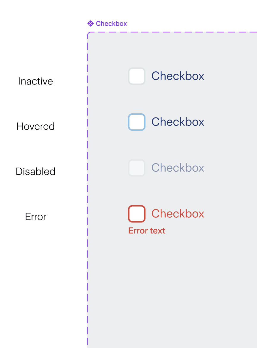
Before
❌ Missing focus state for most components
❌ Insufficient color contrast
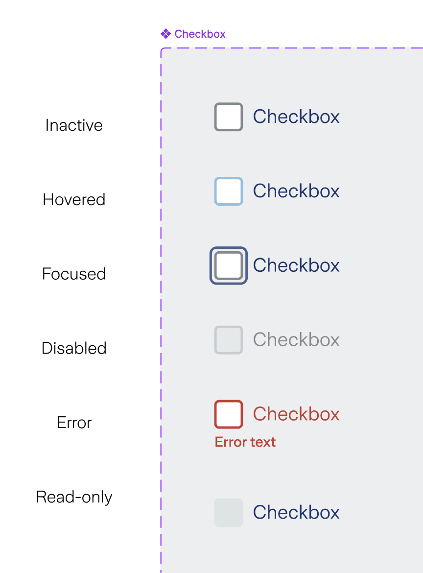
After
✅ Defined consistent focus ring styles across all components
✅ Added focus state as a component variant in Figma to all interactive elements.
✅ Ensured high contrast focus indicators (1.4.11)
✅ Fixed other accessibility incompliances such as color contrasts
Standardizing line height, spacing, and scalable text to meet WCAG accessibility requirements
Increased font sizes and line heights for readability; ensured scalable units for responsive design.
WCAG Success Criteria:
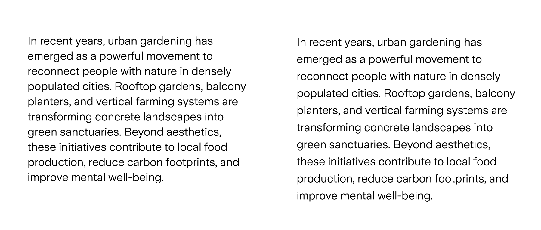
Before
❌ Size: 18; Line height: 24 → insufficient line height
❌ Components breaking at 200% text zoom.
After
✅ Size: 18; Line height: 150% → appropriate line height
✅ Components behaving responsively at 200% text zoom.
✅ Contrast-safe font sizes and weights
✅ Readable defaults for body text, headings, and labels
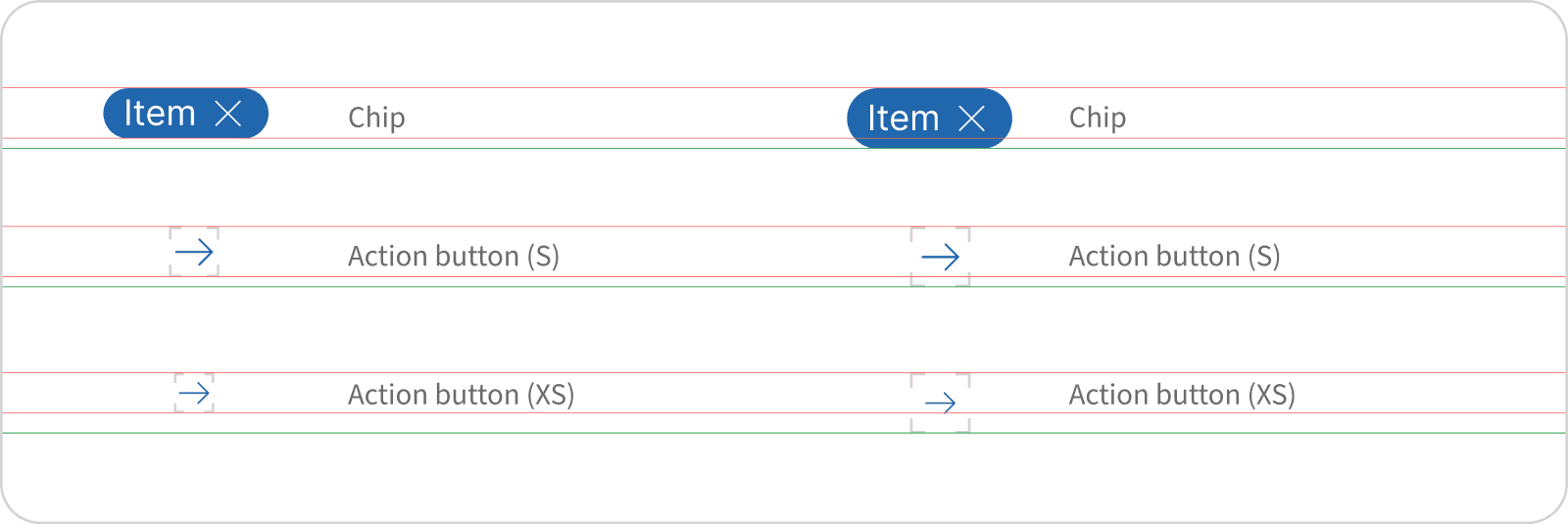
Adjusting touch target to ensure accessibility for users with motor impairments
Enlarged interactive elements to meet the 44x44px minimum for touch devices.
WCAG Success Criteria:
Before
❌ Insufficient touch targets: Less than 24px
After
✅ Increased tap target sizes or spacing to > 24 px
✅ Increased tap target sizes or spacing to > 24 px
✅ Standardized minimum interactive dimensions
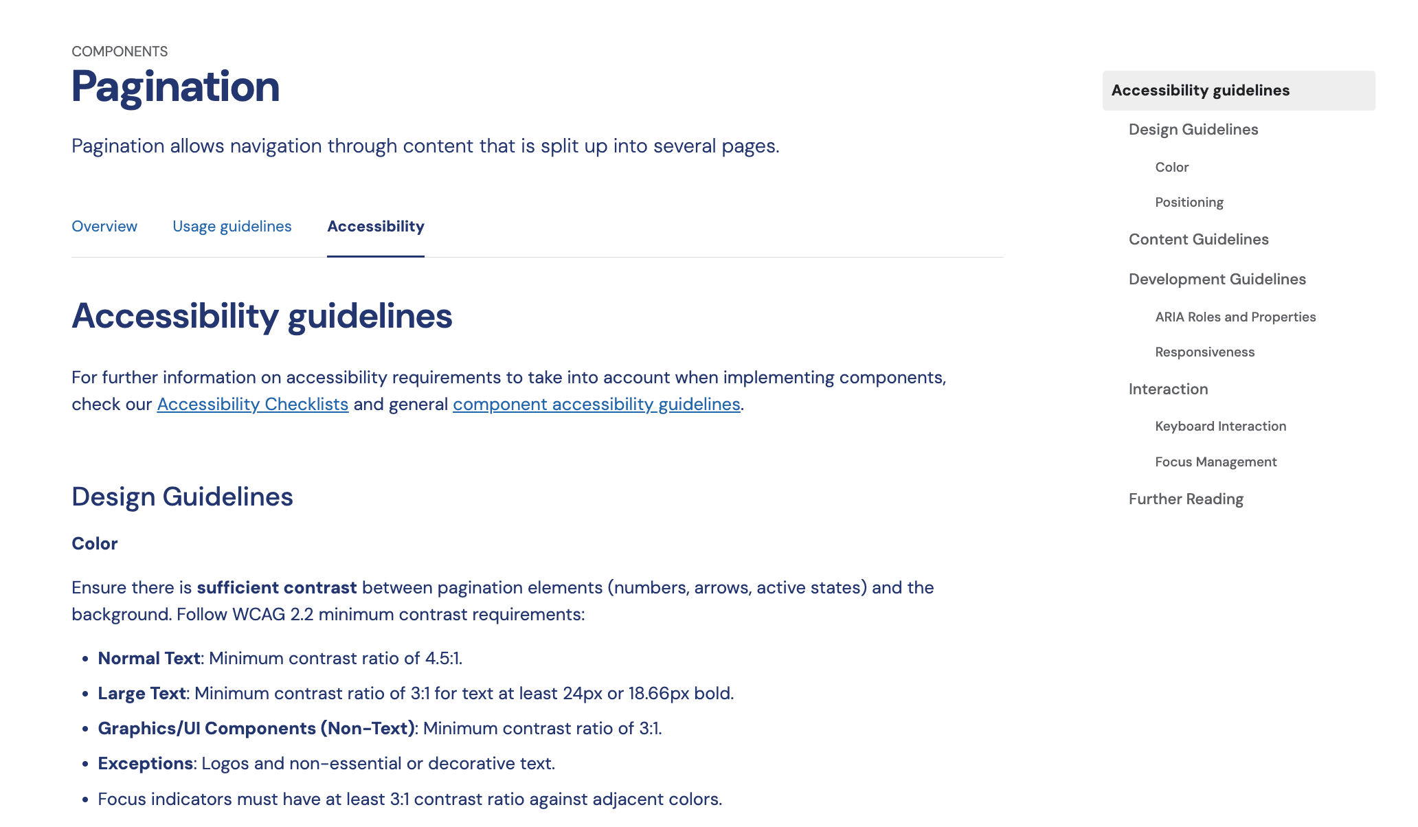
While accessible defaults were built directly into components, documentation plays a critical role in ensuring accessibility is applied consistently across projects where accessibility cannot be fully enforced by the component alone, such as for custom layouts, content density, or contextual variations.
As part of my tasks, I worked on introducing dedicated accessibility guidelines for every component and foundation, covering color usage, focus behavior, touch targets, typography, and ARIA roles for developers.