TIMELINE
Aug 2025 - Present
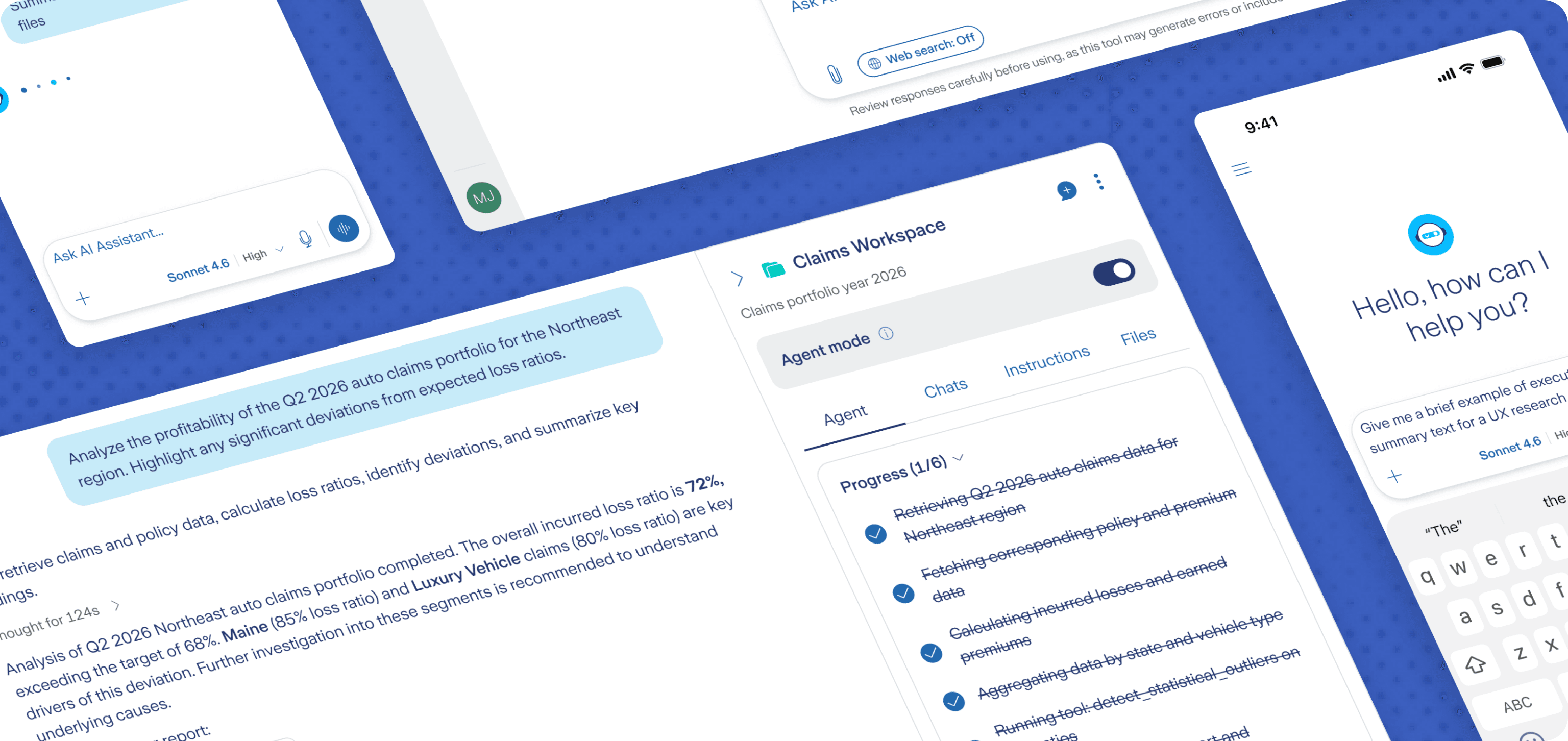
As part of my collaboration with the company's Gen AI Team, I carried out a full redesign of the internal AI Assistant, an employee-only alternative to consumer tools like ChatGPT and Gemini. The goal was ultimately to boost AI usage across the company, while increasing trust in the platform so employees rely on it on a daily basis, instead of using external, unapproved tools.
TIMELINE
ROLE
As the sole Product Designer involved, I led the redesign operations: conducted a benchmark, defined key features, user flows and UX patterns, and updated the UI applying the company's design system.
The company's internal Gen AI assistant was built to give employees a safe, compliant way to work with AI without exposing sensitive information, but its interface now feels outdated compared to modern industry standards.
That gap in perceived quality weakens trust in the experience and the outputs, making the tool feel more like an obligation than a product employees want to use. While most employees rely on it because it's mandatory, a meaningful subset still turns to unauthorised external tools when they need speed, familiarity, or better usability - a behaviour that increases the risk of data leakage or compliance violations.
This creates a high-stakes UX challenge:
Improving adoption and confidence through a UI that meets user expectations - without compromising enterprise constraints - to reduce the risk of reliance on unauthorised tools.
Modern UX that matches user expectations
The new UI aligns with interaction patterns employees already know from best-in-class Gen AI tools like ChatGPT and Gemini. Familiar layouts, behaviours and mental models reduce adoption friction and help users move faster.
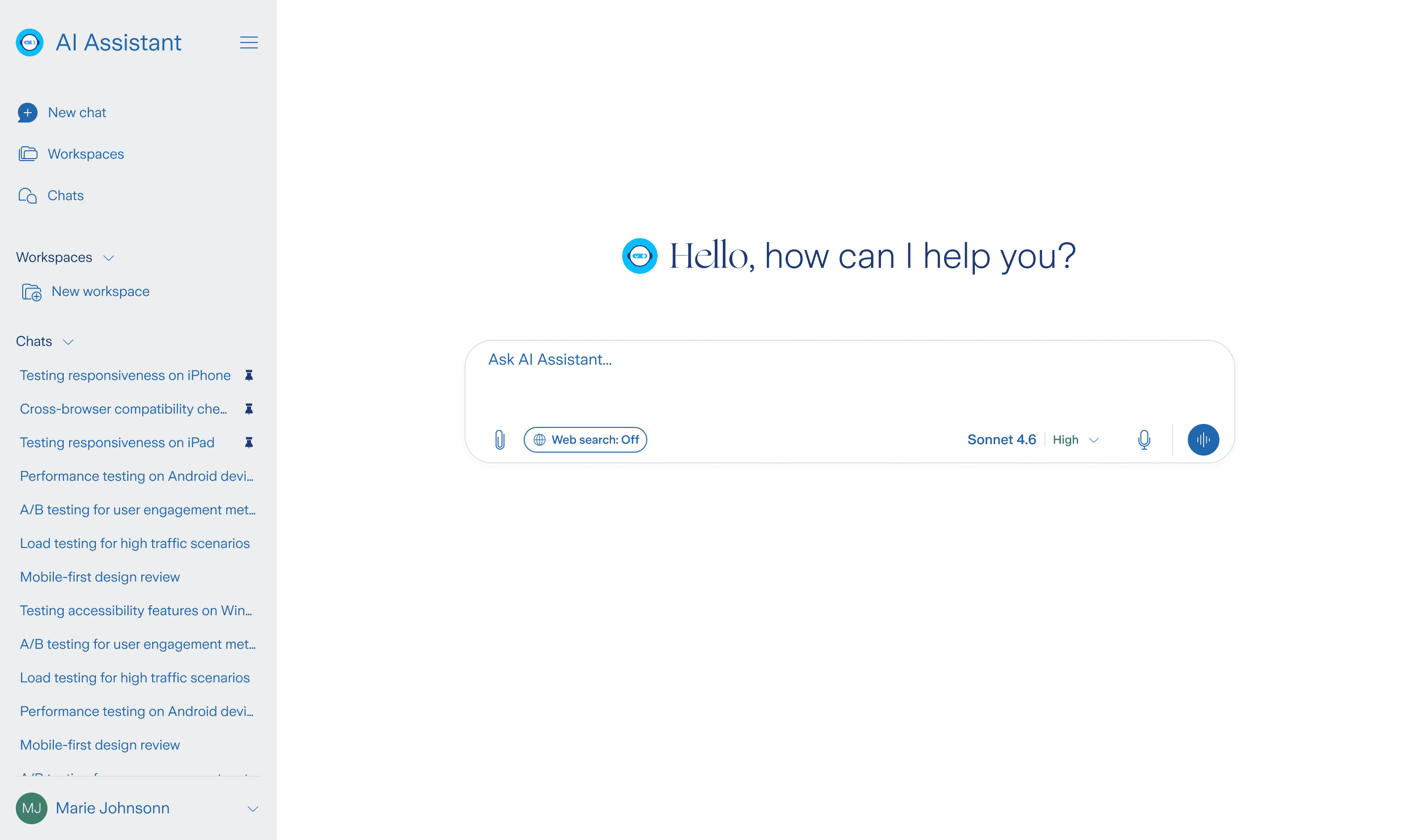
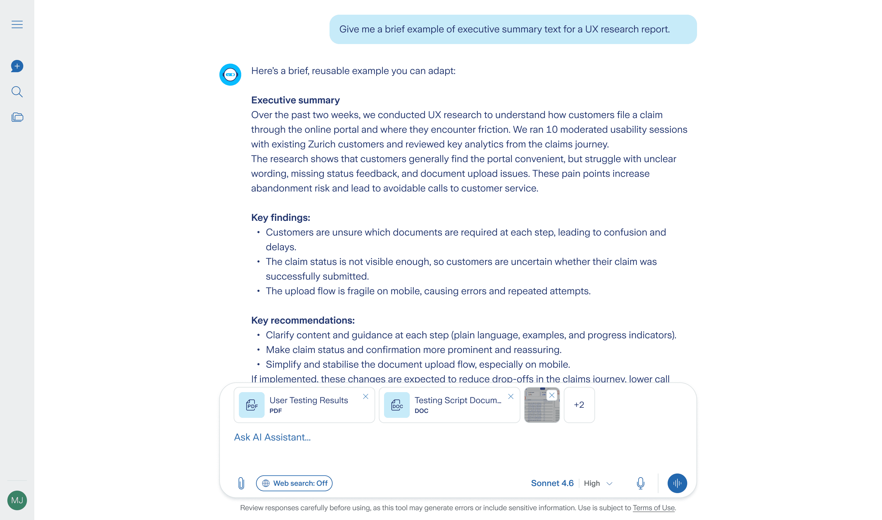
A cleaner UI, with "Focus mode" as the default
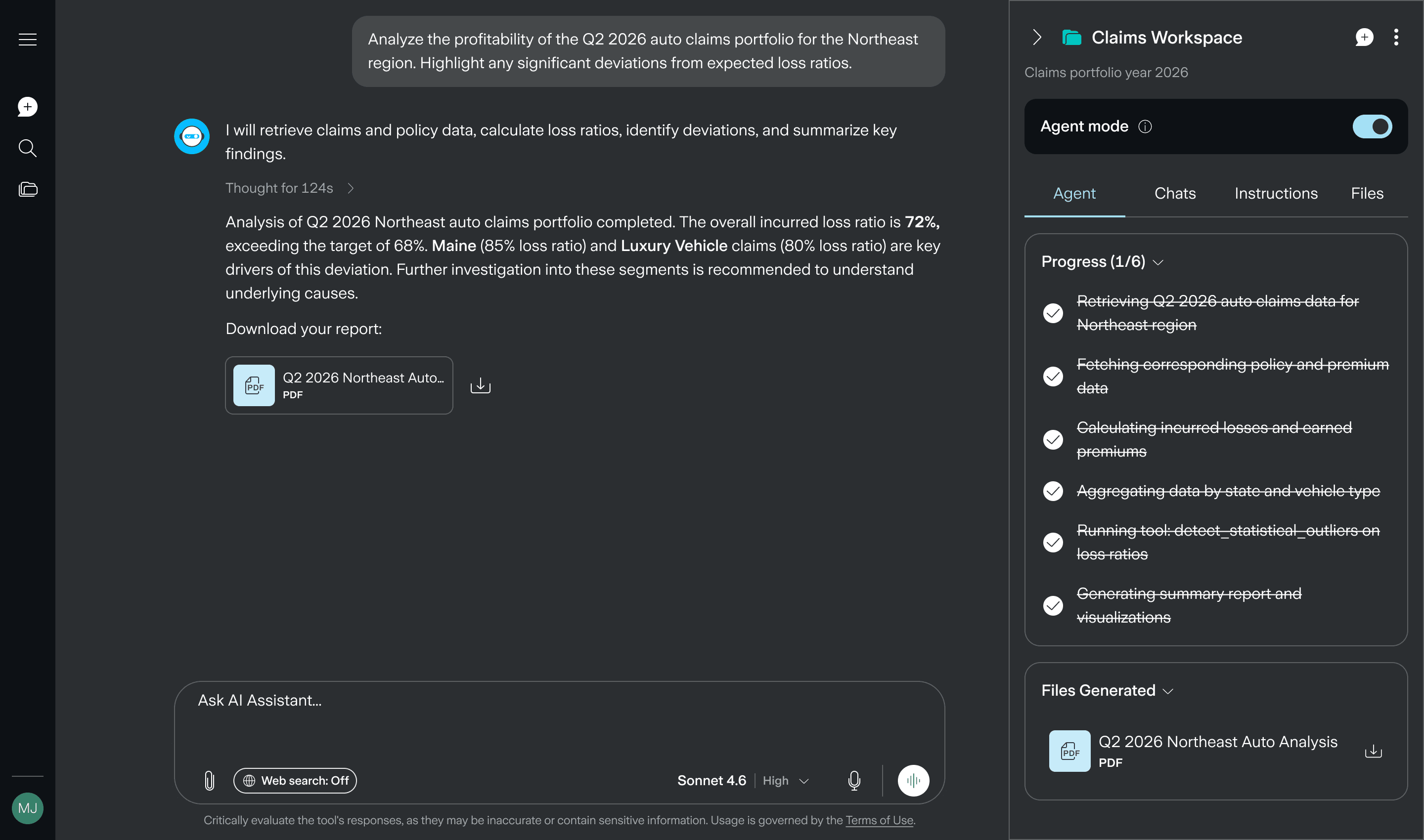
The previous UI was often labeled as "too cluttered". As a quick fix, a "Focus mode" button was introduced to hide unessential UI elements. Now, the "Focus Mode" is the baseline of the new UI: clean, minimal, and deliberate to reduce cognitive load.
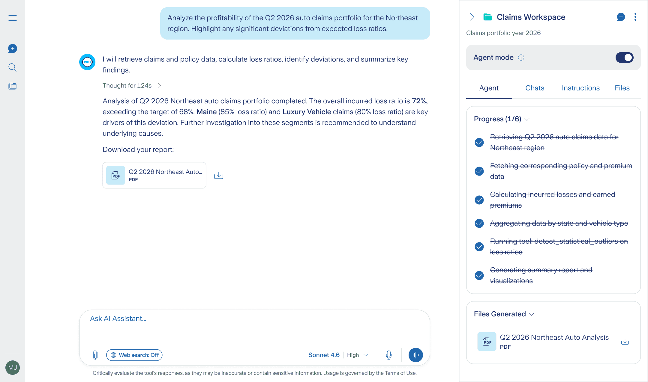
Workspace: where occasional usage and daily usage meet
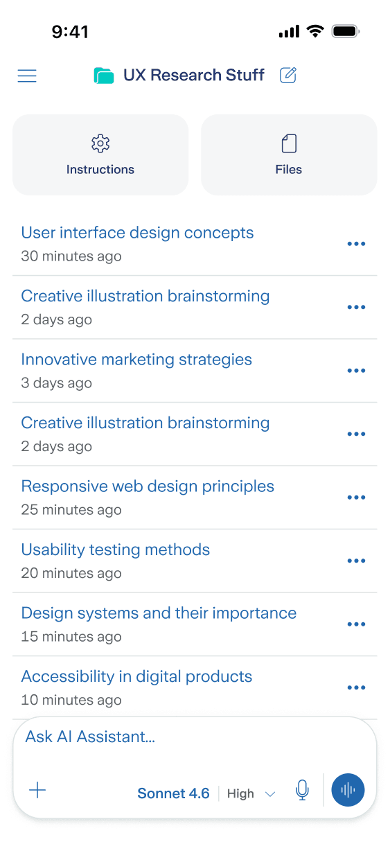
As a Gen AI Assistant specialised in supporting users during their work hours, I pushed for Workspaces (commonly called Projects / Spaces) to assume a whole new level of importance. Differently from how other tools tackle this aspect, Workspaces offer a new type of navigation.
My intervention began with an already identified stakeholder need: "revamp the UI." But what looked like a straightforward "make it prettier" request was actually hiding a deeper truth: an underperforming internal tool creates the perfect base for employees to rely on external, unauthorised tools.
My first step was aligning with the stakeholder on success criteria (reduce adoption friction, increase voluntary usage, maintain enterprise compliance) and mapping the highest-value journeys employees rely on: starting a chat, iterating on outputs, consulting chat history, and organising ongoing work into workspaces.
With the goal of collecting navigation models, prompt entry behaviours, system feedback and content layouts, I began my desk research by conducting an extensive benchmark on some of the most used and trusted Gen AI Assistants in the market - ChatGPT, Gemini, Claude, Perplexity, Copilot and Manus.
The main outcomes from the benchmark that shaped my design decisions included:
Insights
Design implications
Strong assistants reduce noise and keep attention on the prompt + response loop. Secondary actions live in predictable side structures.
"Focus mode" as the default mode. The UI should be uncluttered and simple, with secondary action hidden where users expect them to be.
Assistants are moving from "one chat" to Projects/Spaces that preserve context across time.
"Workspaces" as the default container for ongoing work - with long term memory and specific instructions.
Show trust inside the UI: Perplexity makes sourcing visible with citations. Copilot makes protection status visible (green shield).
Visible trust cues should be added during conversation (consistency, sourcing/provenance patterns, protection messaging).
Design moved quickly and iteratively: low-fi layouts to test structure, then high-fi screens built on the company design system to ensure consistency and feasibility. The key shift was making the clean "Focus Mode" experience the default, using progressive disclosure for secondary controls.
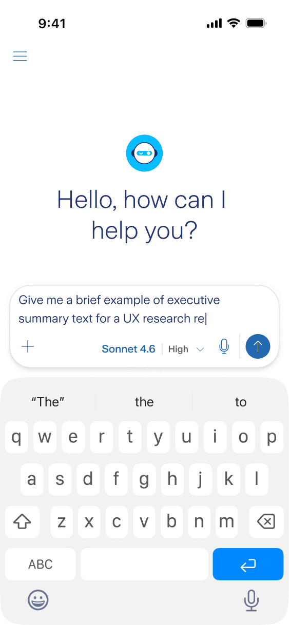
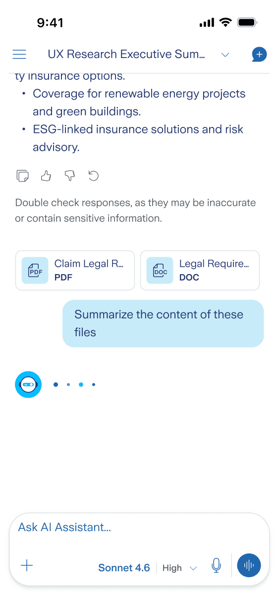
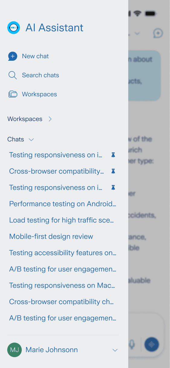
The Gen AI Assistant was born as a desktop-use app, but responsive and mobile versions had to be made. I treated mobile as a different context: shorter sessions, different navigation expectations, and more reliance on quick actions. I reworked patterns that don't translate well (side panels, dense toolbars) while keeping core behaviors consistent so switching devices feels seamless. The output of this phase was a responsive screen set and handoff-ready specs for engineers:
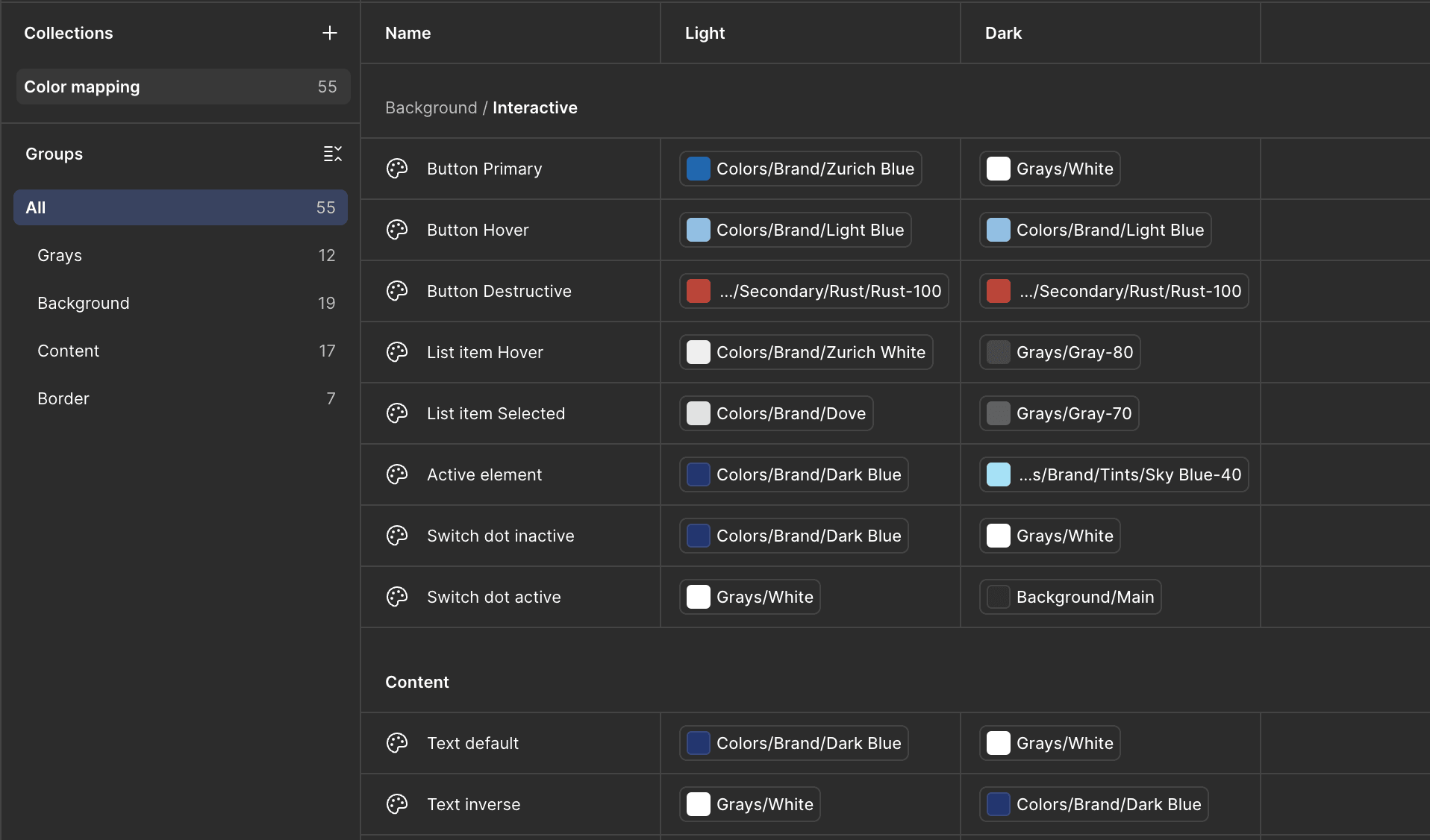
As of January 2025, the company's design system was lacking an "official" dark mode. Confident in my experience in working with design tokens, I've held discussions with the design system team to lay out a variable set that could work for the AI Assistant UI, contributing therefore to the shaping of the official dark mode for the company DS.
Gen AI assistants have been around for a few years, but the UX is still maturing: patterns are emerging, expectations shift quickly, and the best interaction models are often discovered through real usage.
What stood out for me in this project was translating enterprise constraints into an experience that feels modern, intuitive, and trustworthy, while anticipating needs users don't always articulate yet.
Implementation is in progress, so impact metrics will be collected post-release. Next steps focus on learning and iteration: establish baseline usage on current features, define success metrics for the redesigned experience, and combine usage data with user feedback to prioritise what ships next, starting with features like shared chats and a speech mode.